A jolly tool in architecture
 Project #048
house in paraiso
Foto: Giulietta Margot
The North House in Hanayama by Japanese architect Kazuo Shinohara is sober. The white volume is populated by wooden elements of different kinds. Its material palette is concise, photographs were taken in black and white. Yet on the first coloured photo of Shinohara’s twin South House in Hanayama one can spot a red door and a corner of the second door that seems to be green. Wooden beams contrast with the white interior, the wooden floor is rather intense. Colourful boxes, lamps, cups and posters are carefully staged to complete the image’s composition. That photo definitely had to be taken in colour.
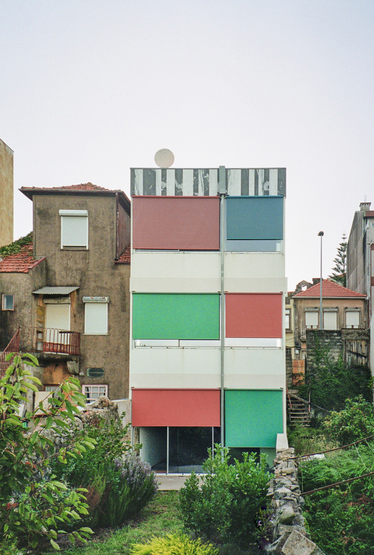
 #079
#079
suspended house
Foto: Giulietta Margot
Timeline
We often work with given spaces and perimeters. Painting everything in white (also a colour) is the first step in these projects. White erases mistakes and imperfections, it creates an abstract background for the project to unfold. Afterwards, colourful elements occupy an imperfect white canvas – fireworks in white. We treat spaces, rooms, façades as canvases. It is worth revisiting our early experiments with colour – unthinkable at the time. From the green kitchen in the "Apartment in Príncipe Real” (Project 016), through the first blue doors and shutters in “Apartment in Chiado” (025), to light blue curtains in “Garage House” (040) and the first pink handrails in the “House with Four Columns” (059), and then to exuberant patterns, to fully painted façades and ceilings. The majority of surfaces in these first works used to be painted in white, floors were wooden, colours, if any, would be less saturated and rather minimal. It was a gradual move from furniture to small elements, from elements to extensive surfaces. We learned to use colour until it became free and natural, almost intuitive to us.
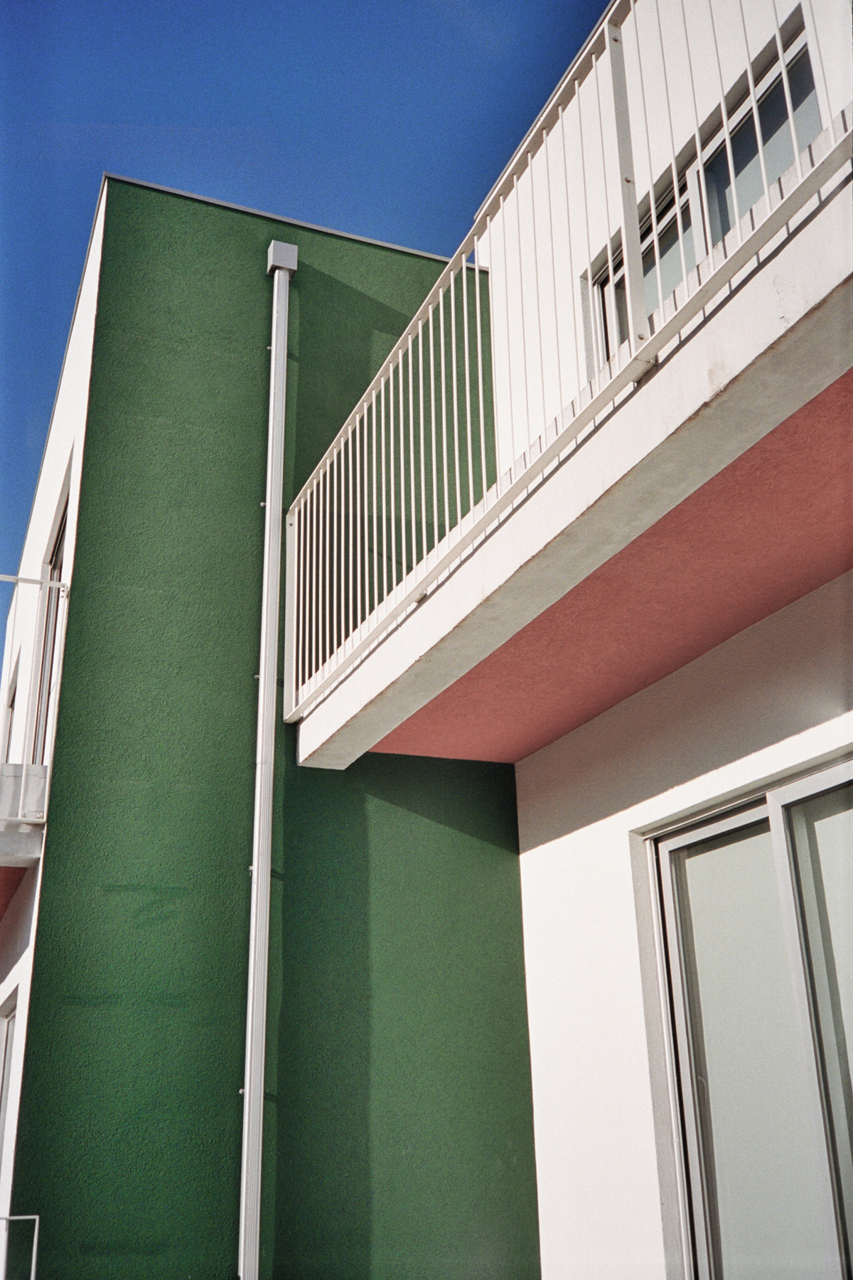
Fully closed shutters of three colours for example animate the back façade of project 079. Glossy green floor acts as a unifying plane within the apartment (086). Side walls of adjacent buildings are vividly painted (114). Doors tend to be separated from the walls (058). Actually, all coloured elements are somehow against disappearing in spaces, complexities and juxtapositions are favoured. Even outside volumes are broken surface by surface (118). We understand projects as approximations of elements and systems. Each system is assigned a material or a colour (155). Green columns in different rooms and levels are then understood as part of one of its layers (125).
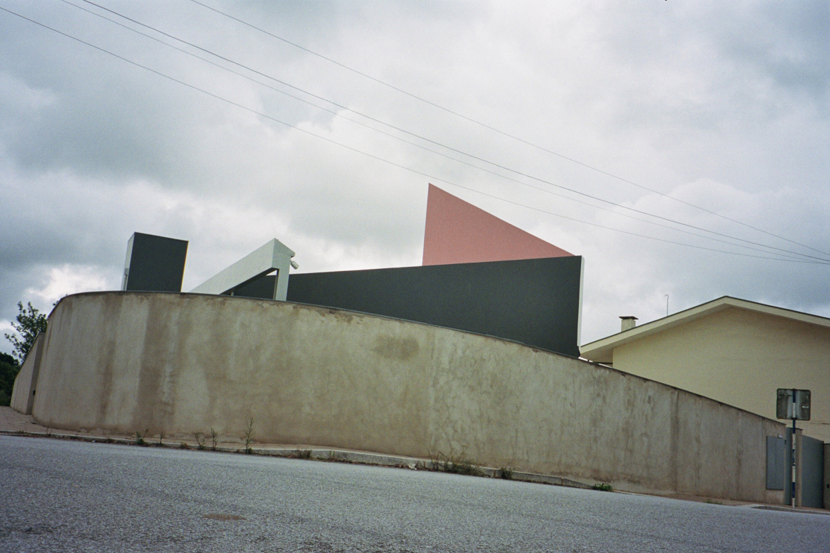 #118
#118
house within
three gestures
Foto: Giulietta Margot
Full disclosure
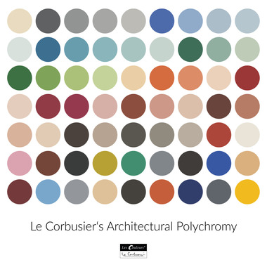
It always starts with that smile, the colour decision. In our case, it was blue at first, that we used in a project – an easy-to-convince kind of colour that could conveniently be called “cold grey” (025, 040, 043, 052). It went off to shades of light green (072, 077, 086). Then pink happened, the light tone was introduced to bring warmth, to balance out cold glossy marble pavements (075, 090). Splashes of red in a couple of projects highlighted necessary exceptions and happy accidents (097). There is a semi-defined palette of colours that repeats between our projects, yet it unavoidably expands. Blue gets tiresome, pink becomes predictable, new actors constantly enter the scene. Some tones and shades naturally emerge from references—warm yellow from Gio Ponti’s stripy ceiling, earthy red from Peter Märkli’s façades of Haus Kuehnis, vivid green from Aldo Rossi’s I-beams. The office joke about never using orange, purple or brown remains appropriate.
If white is about making a canvas, black suggests emphasis and accents. Edges, corners and windows are highlighted (070). Black appears as lines or dots (082). It can also act as canvas, a radically different kind though. In our “House of Countless Windows”, the two sidewalls are painted in an “almost-black blue”, detaching itself from the rest of the system (094). Somewhere else, black suggests a cat & a rabbit (123). The enigmatic black circle of “Folly for Sun and Sound” contrasts with another white cat (107).
We don’t paint enough walls in colour. Just once, for an exhibition of our own work, we allowed ourselves to paint the full room in light green, overlaying it then with a few patterns (105). And it is often a complete element or object that gets painted. It is usually not half a wall or quarter of a column – another one of our hurdles, we can not explain, something we have to try out eventually. The space is divided or disassembled by colour – either all the columns are green, or all the beams are reddish, or ceilings are light blue – our kind of assuring consistency within a complex project. It is tediously systematic, groups of elements are properly distinguished, hierarchies are established. Colour becomes an indispensable compositional device.
Furthermore, colour comes hand in hand with patterns (030, 067, 136). It complements monochrome stripes and checkerboards. It breaks a solid hatch of one colour into grids, lines and pieces. It introduces rhythms and repetitions. A small house with a monumental shower is a perfect example of that (081), where the only built object is demanding a maximum contrast next to the granite stone wall. The slim white tower is wrapped in a continuous pattern of pink triangles.
 #079
#079
suspended house
Foto: Giulietta Margot
Beige ain’t the answer
Colour is a sufficient material. A coat of paint for us is not less important than stone, wood or metal (118, 136). It is also the cheapest of them all. Its amount and intensity often depend on the client’s intellectual elasticity. Colour occupies the realm of taste which certainly makes it less agreeable even between ourselves. It has to balance between not too soft and overly extreme, so that the space doesn’t become a light pink room for a baby girl. Some clients are open to experimentation, others are fixed on white, grey, beige and brown. In one of his interviews, Rem Koolhaas encourages architects to explore a new world where beige is not a necessity: “I don’t find it troubling per se. In certain situations I have actually learned to like it. But I find it difficult to feel any enthusiasm for it. I simply feel a slight disappointment that the final aesthetic consensus of humanity is gravitating towards beige.”
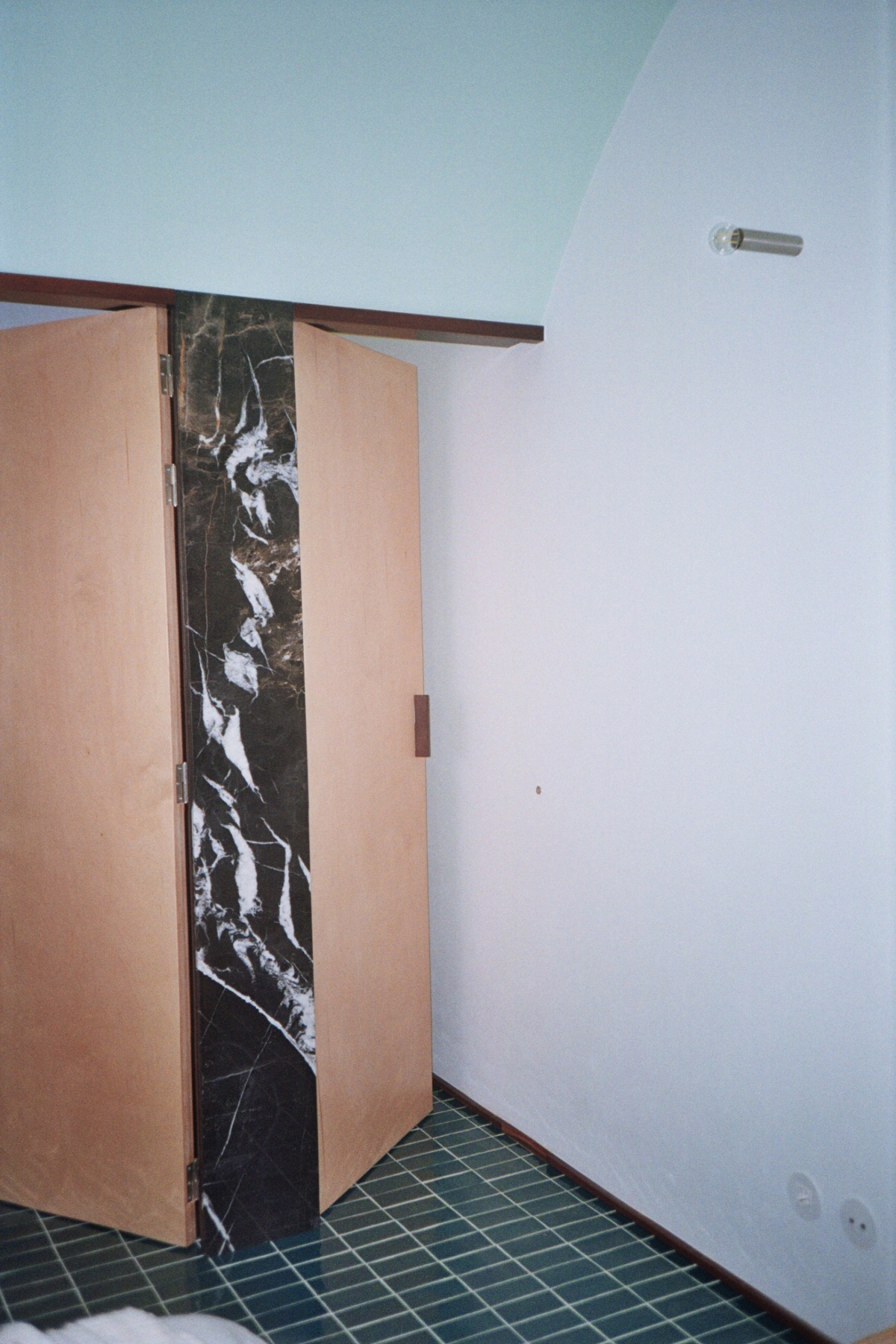
Colour also requires precision. NCS and RAL codes, Japanese Dictionary of Color Combinations by Sanzo Wada, matt or glossy, texture or no texture, endless 3D renders with 50 options. Often it comes from a catalogue, and one has to choose between 20 tones of plaster out of which 15 are variations on beige and grey. Unfortunately, most product catalogues are variations on beige and grey. And brown.
 Lorem ipsum dolor sit amet, consetetur sadipscing elitr, sed diam nonumy eirmod tempor invidunt ut labore et dolore magna aliquyam erat, sed diam voluptua. At vero eos et accusam et justo duo dolores et ea rebum.
Foto: Giulietta Margot
Fluidity
Eventually, colour got normal and acceptable for us. Colour is actively used. Colour is celebrated. Its application is extended over more and more surfaces. Its meaning is questioned and challenged from project to project. Maybe white will appear less and less present. Maybe we’ll break our rule and paint a wall in orange. Colour is a trope of sorts that persists. It is a jolly tool in architecture. Architects could be joyful colourists. To quote Ettore Sottsass: “Colours are like words. With colors you can tell stories. Words have histories and stories and significances within themselves. For example ‘love’ means one thing, but ‘amore’ in Italian means something else, slightly different... Colors are the same.”
 #087
#087
house of accents
Foto: Giulietta Margot
A coincidence?
In his “Fourth Style”, Kazuo Shinohara became much more familiar with colour. He ended up highlighting specific elements in his projects—green doors, blue columns and pink window frames stood out against white walls and concrete interiors. The Hanayama Clinic, a few meters away from those two older houses seems to reveal a different author, older and bolder.
Our relationship with colour is also more committed. Gradually it takes over more and more complete surfaces. Photos of our projects in black and white seem right and at the same time wrong. Discoveries are still to be made. Unexpected tones are to be applied. Blue and green are to be abandoned maybe. When it comes to colour, like almost everything else in our architecture, we are interested in breaking our self-imposed limitations.
 #030
#030
completed houses
Foto: Giulietta Margot
Colour is both logical and intuitive. It brings elements together and separates them from the neutral background. It brings character to space. It acts on various scales. It becomes a defining feature in some projects. It facilitates reading of a project. It contrasts. It dissimilates. Colour is easy. Colour is arguable. It usually raises problems with municipalities. It normally has to be toned down if we submit a competition proposal. It doesn’t always survive client meetings. But it gets better. It becomes more and more acceptable. It is overcoming its reputation of unnecessary decoration. It is consistently included in our projects. It becomes a spatial element. Projects are assembled out of figures, lines and colours. As you can read in the book “Colours” by Rem Koolhaas/OMA, Norman Foster and Alessandro Mendini: “The actual three-dimensional space is overlaid, broken up, complemented, contradicted by the spatial effect of the colour.”