Architecture between 0.4 and 0.7 micrometre
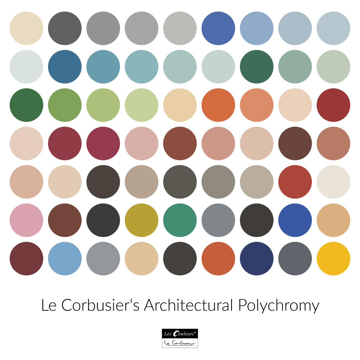 Le Corbusier is known for his precise choice of colours. He developed a colour palette of 63 colours, which is still used by many designers today
Abb.: Les Couleurs Le Corbusier
Colour in architecture may seem a no-topic. It is a bit like sound in music. Everything has colour, and so have buildings. Yet, the use of colour in architecture is something different. And there is actually a lot to say about it. But what are we talking about when we talk about colour in architecture? It is not a waterproof definition but until very recently, let’s say the turn of the century, it was possible to make a simple distinction: Some colours in architecture come with the materials, like natural stone, bricks, and metal. Others have been added, like glazing on ceramics, paint on steel or wood, aggregates in concrete and so forth. It is obviously more complicated than this, but let’s accept this definition for now. Traditionally, most of these added colours have been applied in the form of paint, and the story of modern architecture is deeply tied with the development of the modern paint industry. A lot of architectural materials are still used as they are found, and often they are found nearby. Particularly heavier materials like brick and stone traditionally do not travel far, and that is for instance why so many Parisian buildings have limestone façades, which came from quarries in the region (and even Paris itself). Local materials traditionally give towns, cities and regions their "couleur locale".
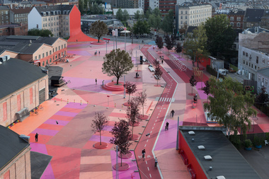
But added colour can also be part of it. In certain places there are prevailing colours. Think of the bright reds and yellows in Copenhagen, the white and blue of Santorini, the greyish green of Saint Petersburg, the pink of Miami Beach. Even if those colours may not have been always as prominently present as they currently are, they work as powerful identifiers of these places now.
Similarly, there are colours that are the trademarks of architects. The pale green and blue of Le Corbusier before the Second World War and his saturated green and blue (and yellow and red) after the war, the pinks of Luis Barragan, the rainbows of colour in the work of Aldo and Hannie van Eyck.
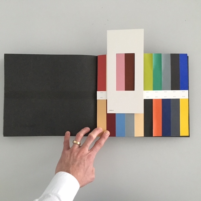 Les Couleurs Suisse AG is the licensor of the original Le Corbusier colours. Among other things, the company publishes and sells books that help combine its colours.
More information:
https://shop.lescouleurs.ch
Foto.: Les Couleurs Le Corbusier
New -isms come with new colours
Preference for colours are subject to change. New -isms often come with new colour palettes. Postwar modernism has its primary colours and their pastel offspring. Late modernism had brown, beige, and avocado green. High tech typically came with bright blue, red, yellow and green. Candy colours are postmodern; ethereal greens and blues are supermodern. Lime and magenta became popular in the early two-thousands and emerald green and bright yellow in the last ten years.
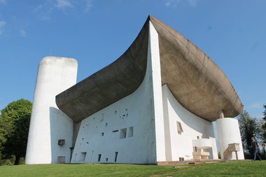
Also in natural colours there are architectural fashions. The link between concrete grey and brutalism is perhaps the most obvious case in point. Almost everyone who is an architectural insider loves, or likes, or at least appreciates brutalism. Almost every outsider dislikes it. Its greyness is definitely part of the love and hate. It is quite an achievement for a symbol of blandness and neutrality that grey is such a controversial colour in architecture.
In the world of architecture there is an enormous appreciation for concrete, which is both structurally reliable and formally versatile, even if more and more insiders hear a moralistic voice whispering in the back of their head: ’but the environmental impact’. Insiders love concrete’s sophisticated greyness (for them nothing is worse than painting it over, which is a cardinal architectural sin), and how it can be finished. They also love to point out that by adding aggregates a broad palette of tones is possible in concrete, from earthy to cool, as the work of Tadao Ando, David Chipperfield, Valerio Olgiati and many other architects shows.
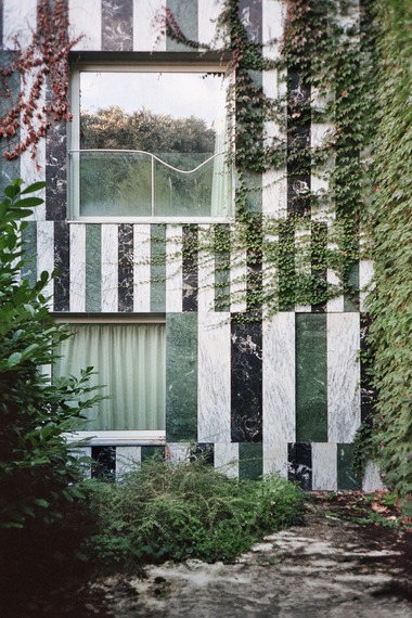
The fact that grey can be colourful is also underscored by the work of Dutch painter and colour advisor Herman van Hooff. Recently, a book was published about his works and ideas with the beautiful title "Bonte grijzen", which translates as ‘colourful greys’. It aptly describes the subdued colour schemes Van Hooff developed in a large number of architectural projects. His pared-down greyish colour spectrum works perfectly to make buildings and interiors an unassuming, harmonic background.
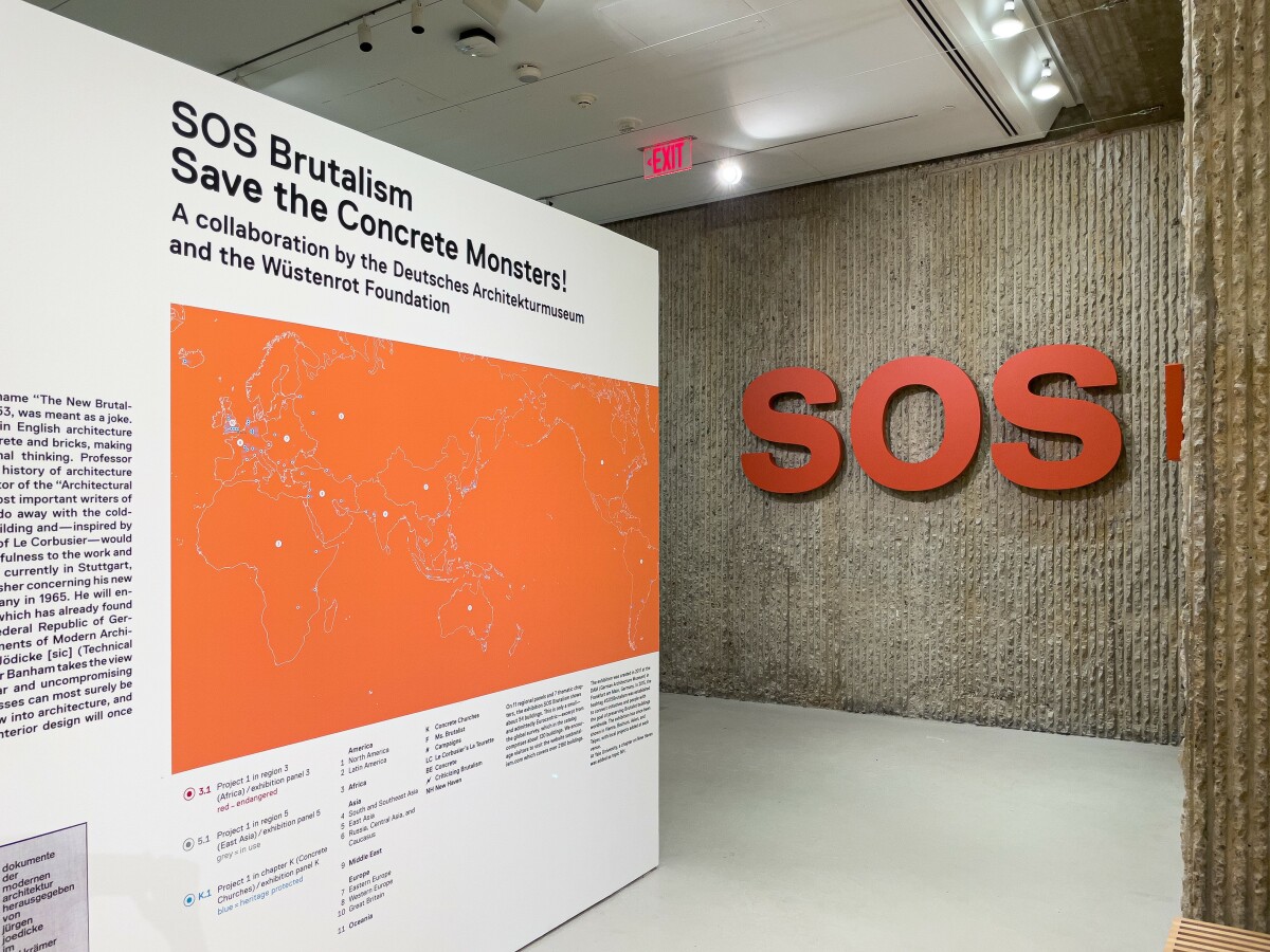 The link between concrete grey and brutalism is a case of architectural fashion. The love of architects for the material and the era on the one hand and the society's disdain for brutalism on the other is particularly evident in the travelling exhibition „SOS Brutalism – Save the Concrete Monsters!“. (DAM Frankfurt and Wüstenrot Foundation). The photo shows the exhibition in New Haven 2022
Foto: Felix Torkar
Colour-sensitivity and colour-poverty
Van Hooff’s modest colours are the opposite of what is usually the first association with colour in architecture: loud colours that stand out. Another Dutch colour expert, Rob van Maanen, has shed his light on this topic in an underrated book from 2012 "De Kleur van de Stad" (‘The Colour of the City’ and as a disclosure, I wrote its preface).
Van Maanen divides colours on the exteriors of buildings in three categories: the background of general colours, the accents of specific colours, and the exceptions of incidental, manifest colours. The first consists of the prevailing palette of a city which is determined by local materials and traditions, like the blond colours of Parisian limestone, or the browns, reds and yellows of brick in North-western Europe. The second category comprises the colours that do stand out but have been around long enough to be considered typical, like the blue roofs of Santorini. The incidents are the colours that are not only loudly present but also really different from anything anywhere near. These are the colours that often come to mind first when one thinks of colour in architecture.
Van Maanen’s sympathy lies with architecture that at least acknowledges the general colours, as a form of contextualism that not only takes into account the landscape, topography, typological and morphological traditions, but is also colour-sensitive. But as a man of colour he also appreciates an astute colour incident, which obviously only works if not every other building is trying to pull off something similar.
Early in his book Van Maanen points out how the probably well-intended standardization of the „Reichsausschuss für Lieferbedingungen” (State Committee for Delivery Conditions) has led to a certain colour poverty in the building industry, particularly in Europe. The German committee was created to ensure that everyone would agree under all circumstances which red was the official red. Known by its acronym RAL, the committee in 1927 brought out a colour chart of an extremely small number of colours (forty!), and later developed a still small set of 216 RAL colours. Since the 1990s almost two thousand colours have been added, which may sound impressive, but it does not change the fact that RAL offers only a tiny fraction of the circa one million different colours that human eyes can see. Since many manufacturers of building products, and paint, adhere to the RAL system, it means that a lot of architecture is made out of a relatively limited colour range.
But all one million colours are now within reach, thanks to the light-emitting diodes (LED), whose development took place mostly during the last two decades. It is now possible to make LED media façades and indoor LED illumination that can actually emit the whole spectrum of visible light, with wavelengths ranging from 0.4 to 0.7 micrometre. Thanks to LED technology architecture no longer needs to have fixed colours, it can now have virtually every colour at any given time. This is a revolutionary change, also because it effectively ends whatever connection there has been, or could be, between colour and architectural form and space. As a consequence, any building can have any conceivable colour, making the use of colour in architecture perhaps even more important than it ever was.